Denim Style Guide
This style guide below defines Denim’s visual identity, ensuring consistency across all brand materials. It includes logo specifications, placement guidelines, typography, color palettes, and real-world applications such as business cards, advertisements, and digital assets. Additionally, it provides direction on selecting stock photography that aligns with the brand’s tone and messaging.
This serves as an example of the comprehensive branding materials I can create for a company, providing clear guidelines internally and could be shared externally to maintain a strong and cohesive brand identity across all platforms.
/// The goal of the Denim style guide was to unify branding across all platforms, ensuring a professional and recognizable identity. It established clear rules for logo usage, typography, colors, and visual elements, reinforcing Denim’s modern and approachable aesthetic. The guide also outlined the brand’s tone and messaging, helping to create a consistent voice across marketing and product communications.
//// Logo Design
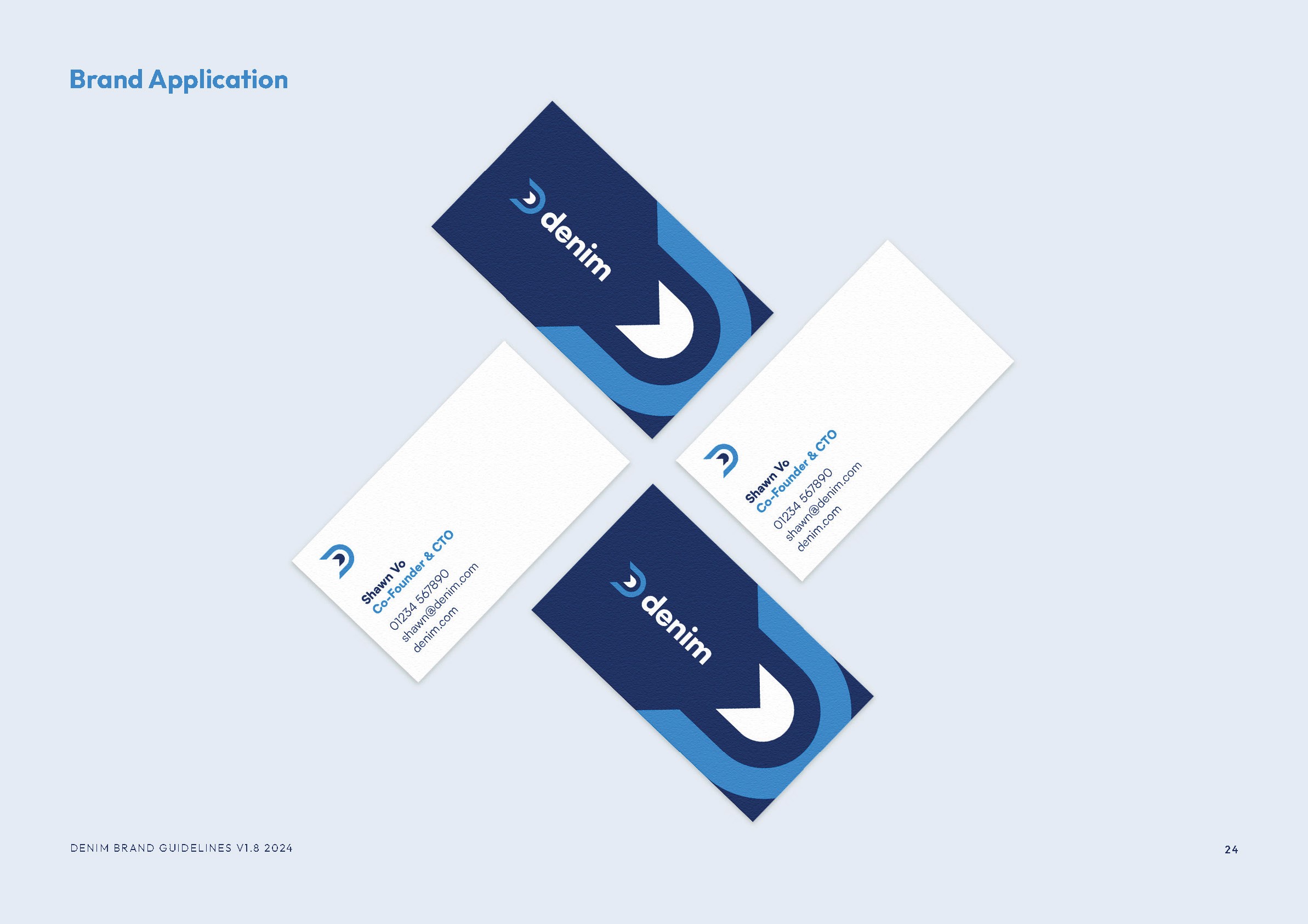
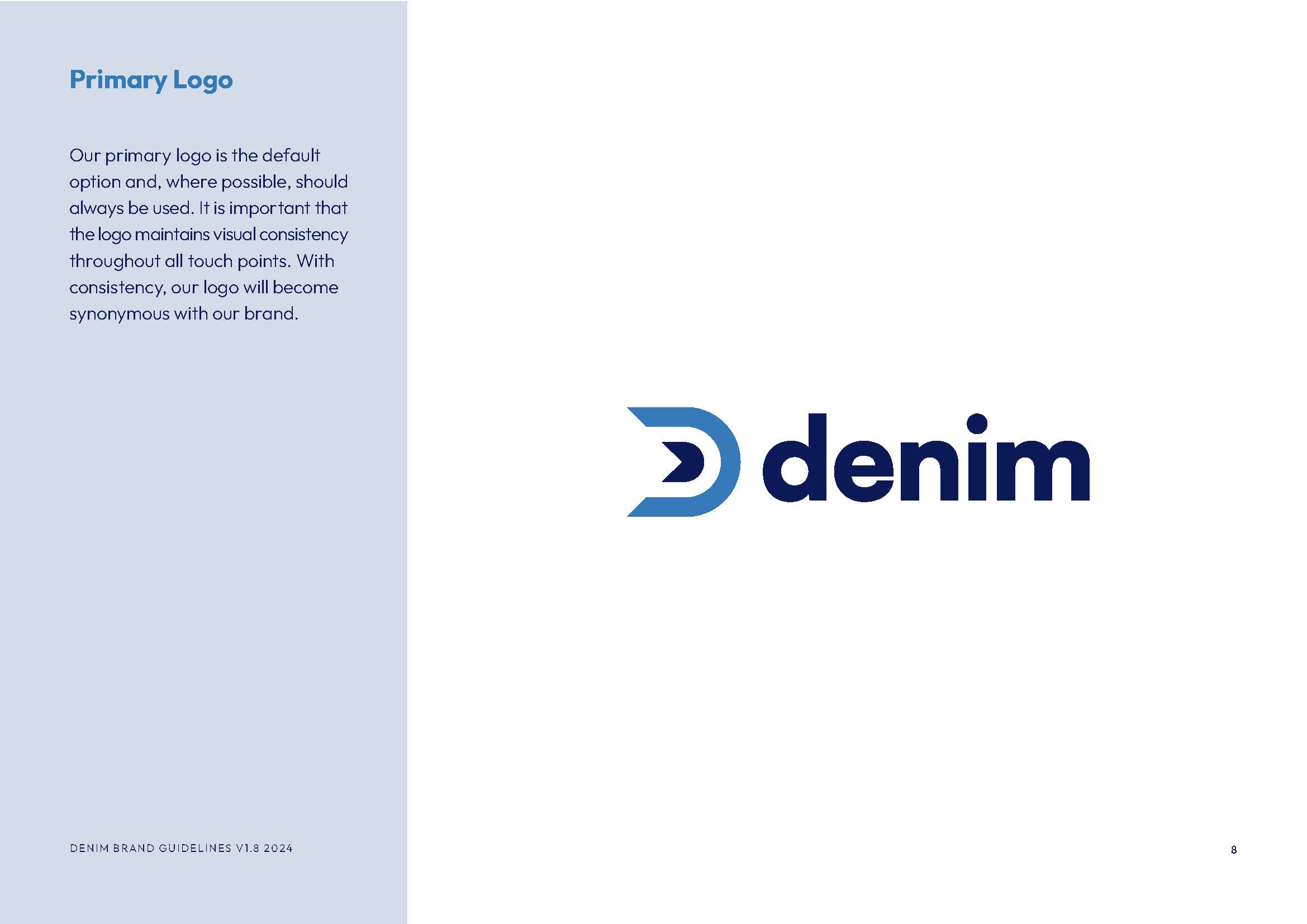
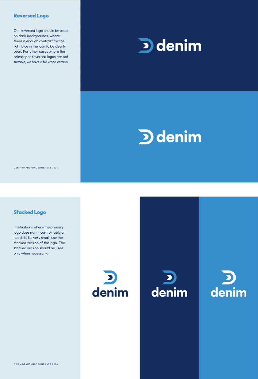
The logo is the face of the brand, often the first impression someone has of your company. To ensure Denim remains recognizable across a wide range of touchpoints, I created multiple logo variations that maintain brand cohesion in any context. Whether it's a light or dark background, small space or large format, the alternate logos including reverse color and stacked options ensure flexibility without compromising identity. These variations allow the brand to be consistently represented across digital, print, and environmental applications — always clear, always Denim.
/// Brand Redesign Example
I redesigned Denim’s customer testimonial collateral, I wanted to elevate what was previously a text-heavy, generic PDF and create something that felt personal, modern, and clearly branded. The old version (shown on the left) was cluttered, with little visual hierarchy and had more generic branding and our old identity.
In the new design (right), I prioritized human connection by drawing attention away from the overall Trustpilot score and toward the real voices of our customers. People love people, so I used white speech bubble containers to make individual reviews feel like direct, personal endorsements. This creates a more emotional, trust-building experience that resonates with prospective users.
I also introduced bold brand imagery, like aerial logistics photography, to visually reinforce Denim’s role in transportation since our software is in the background keeping loads moving, while a structured grid keeps everything clean and readable. The result is a more strategic piece of content that feels elevated, human, and trustworthy.
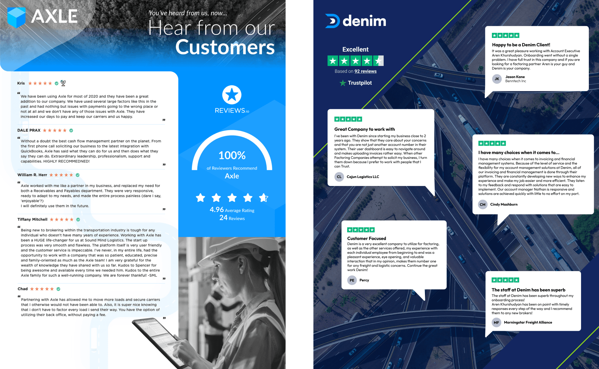
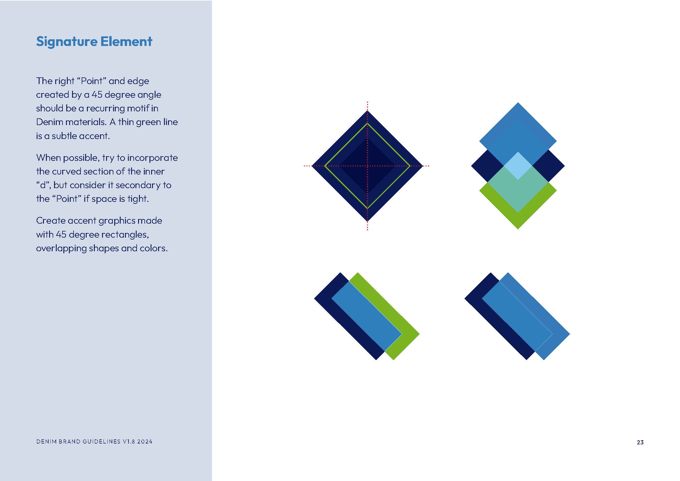
The refreshed reviews design was also an opportunity to bring core brand motifs into a live piece of marketing collateral. As shown in the brand guide, Denim’s visual identity uses recurring 45-degree angles and overlapping geometric shapes to symbolize connection, speed, and forward momentum.
In my layout, I incorporated a thin diagonal green line as a subtle brand signature. This not only aligns with our guidelines but also leads the viewer’s eye through the composition. The clean blocks, layered spacing, and angular cuts mirror the “point” motif and establish visual consistency with other Denim materials.
This kind of detail helps strengthen brand recall and creates a more polished, professional experience — even in something as simple as a testimonial sheet. It’s a great example of how thoughtful design systems can scale and show up meaningfully across assets.
/// During the transition from Axle to Denim, I played a key role in refining and expanding the brand guidelines. This involved:
Auditing existing brand elements to identify inconsistencies.
Establishing clear rules for typography, color usage, and visual hierarchy.
Creating documentation for logo usage, spacing, and variations.
Developing brand voice and messaging guidelines to align with Denim’s evolving identity.
Ensuring the guide could be easily shared with external partners to maintain consistency in co-branded materials.
Updating the guide as the brand continued to grow.
/// The rebrand process introduced challenges in maintaining consistency across multiple touchpoints. Some materials still carried Axle’s identity, while others lacked clear direction in how to implement Denim’s updated brand elements. Without a structured guide, the brand risked appearing fragmented and inconsistent.
Ensuring Consistent, Accessible Brand Colors
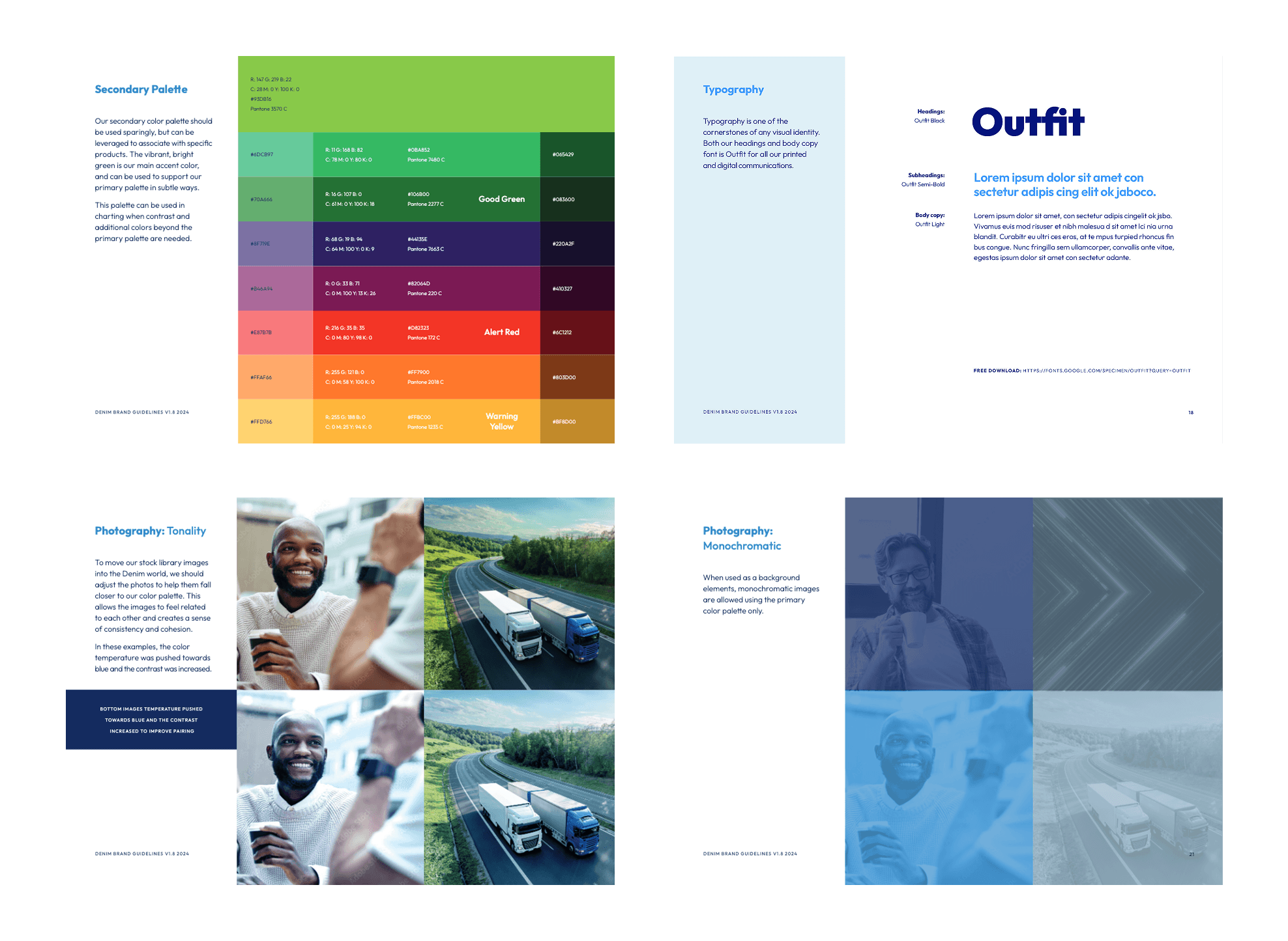
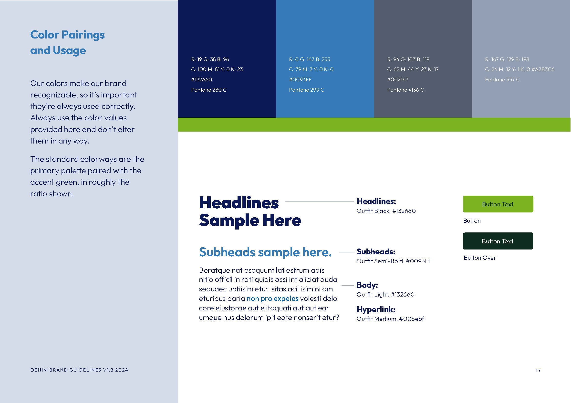
This section of the style guide details the main brand colors and pairings, complete with precise specifications in RGB, CMYK, HEX, and Pantone formats. These detailed codes ensure that designers can accurately reproduce the brand colors across both digital and print media, safeguarding brand integrity at every touchpoint.
In addition, I’ve developed multiple button options that not only align with the brand palette but also meet WCAG accessibility standards. When I started at Denim, many areas of the website were using a bright green button paired with similarly green text—a combination that, while eye-catching, resulted in a contrast ratio of only 2.71:1, making the text hard to read especially on smaller screens. I quickly updated the website and the guide to improve legibility. Now, the text and background color combinations are optimized for high contrast and readability, ensuring that all user interfaces are both visually compelling and accessible to everyone.
This comprehensive approach guarantees a seamless transition from design to production while upholding inclusivity and consistency across all applications.
/// The Denim Brand Style Guide provided a structured reference for both internal teams and external collaborators. By defining clear guidelines for design, messaging, and tone, the guide ensured a cohesive and professional brand presence across all digital and print materials. Additionally, the guide was designed to be easily shared with external partners, helping them align their co-branded content with Denim’s identity. This ensured brand consistency across all touchpoints, from marketing materials to third-party integrations.
For the full document, view the complete PDF here.